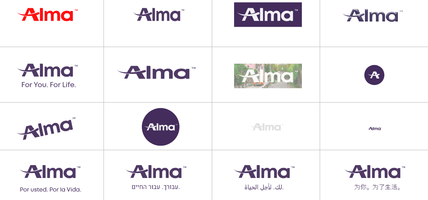
Used for small areas. When letters are smaller than 8pkt / 15 pixel – use without slogan.
Used for small digital environments, app headers, favicon etc. Should always be larger than 16×16 pixel.
Used for social media posts, headers, banners, other matirial applications with limited space.
Used for social brochures, print ads in which a brand signature is important.
The preferred approach is to use the full version of our logo, however, flexibility allows greater prominence while still maintaining a full understanding of our logo visibility.
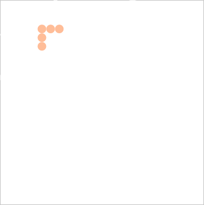
The Alma logo is our most basic brand symbol. To ensure it’s visibility and impact make sure it has enough clear space around it and that it’s used in the correct form and tone.


We developed an easy system to make sure our logo always has enough clear space around it.
Our logo has enough self confidence to keep it’s original appearance, let’s not change proportions, color or type.
The written language of our slogan remains English.
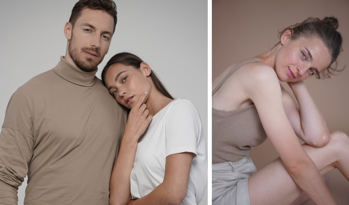
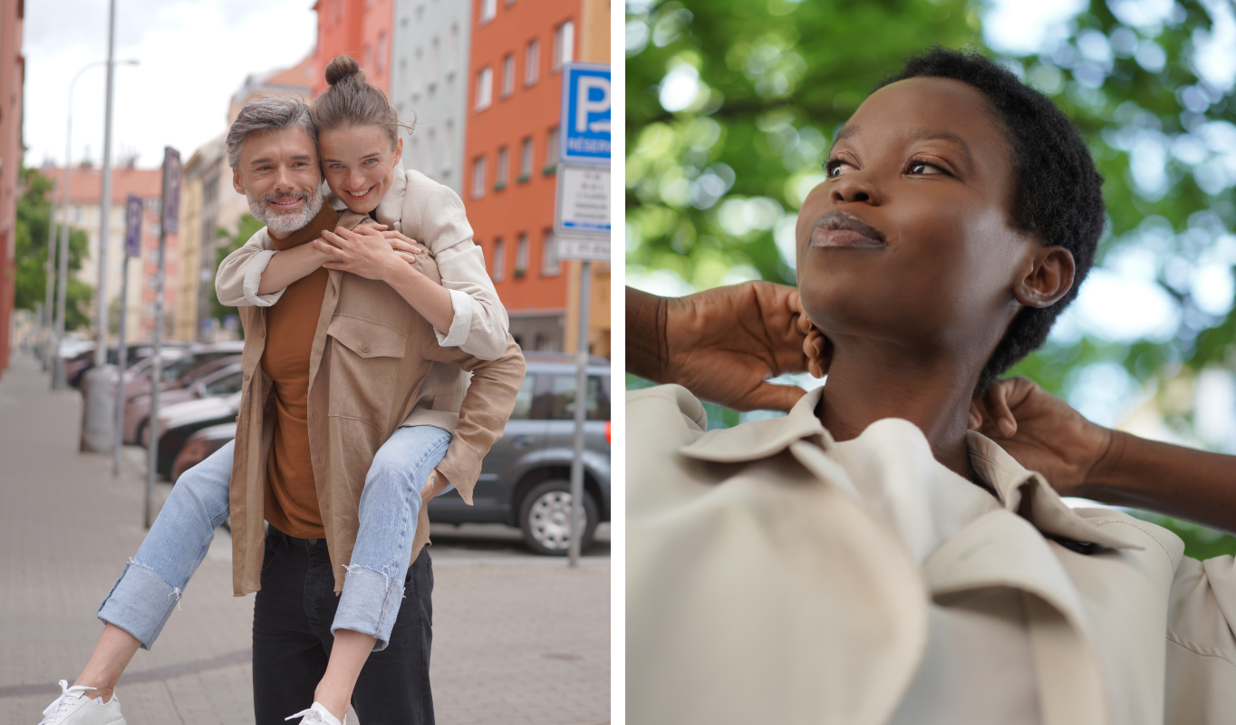
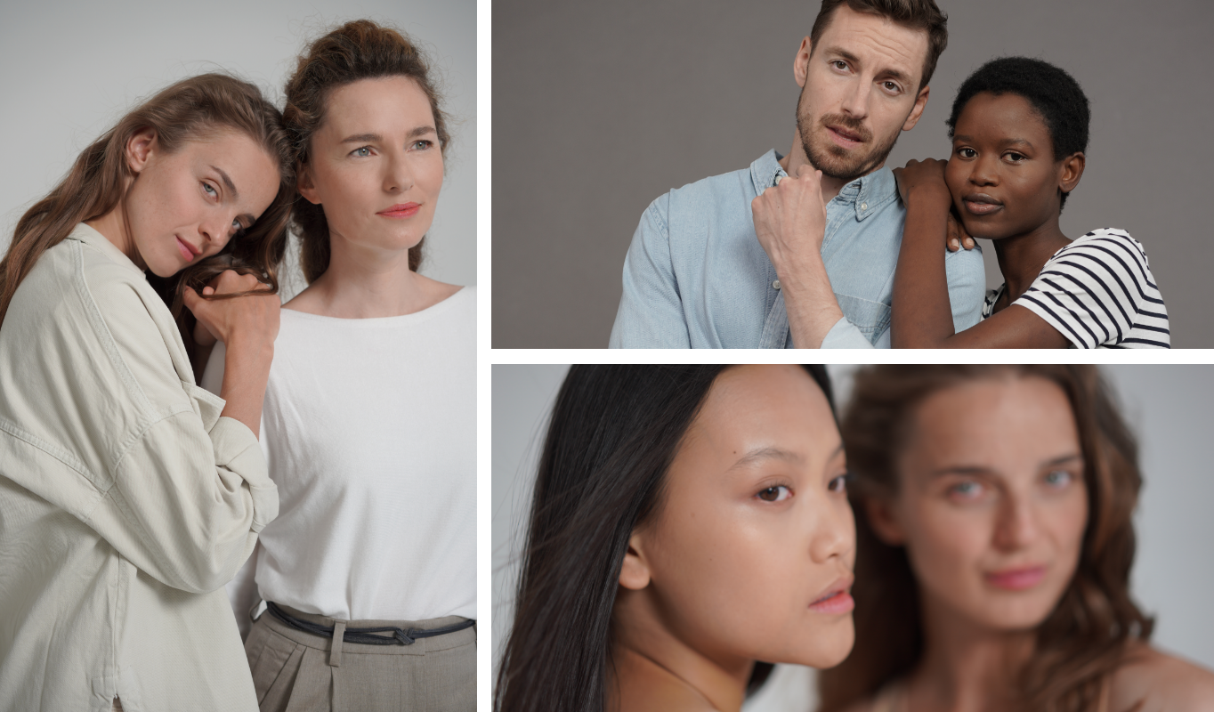
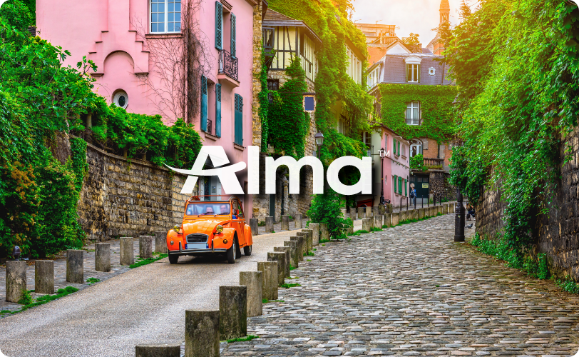
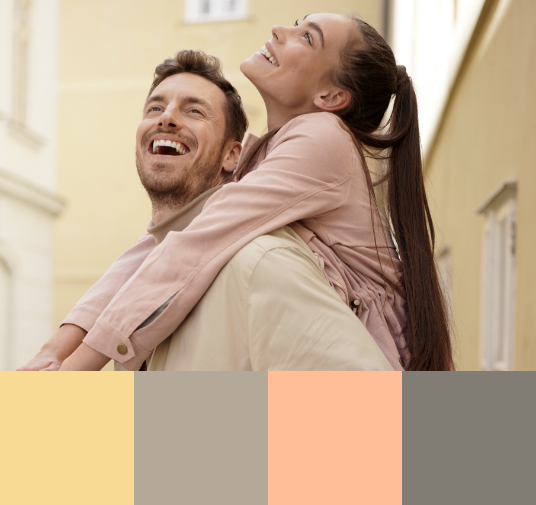
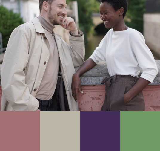
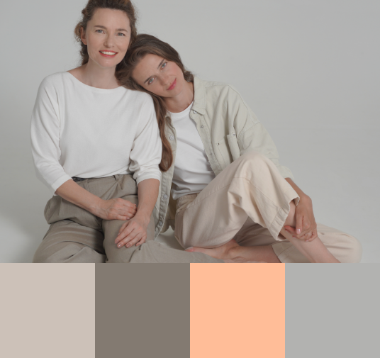
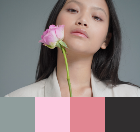
Our color palettes are iconic and help the brand stand out. The Alma purple goes back a long way and links us to our roots. However, we prefer real-life color and let natural appearance and real photography speak on our behalf.
Alma purple is our primary brand color. Wherever possible we prefer to use it for headlines and collaterals.
CMYK: 83 92 34 26
RGB: 67 45 93
Pantone: 669 c
#33285C
CMYK: 0 30 40 0
RGB: 255 189 152
Pantone: 162c
#ffbd98
CMYK: 67 65 62 62
RGB: 45 42 38
Pantone: Black 6 c
#302e2f
As we progress through digital platforms, so do our visual updates. Under the right conditions our palettes become deeper and more suitable to living-digital outputs.
It’s ok to use colors, that are not our brand colors, as long as an “Alma presence” is maintained.
Real life, real people and real environments lead us as we pick our color palette. Doing so means we don’t always have to apply another layer of color, rather let nature do it’s thing.
We use one font for our corporate typography and 2 fonts for our sub brands.
Mont is our most versatile typface, used for all medias, body text and headlines.
When designing for corporate needs we stick to this font.
When it comes to sub-brands, we also use Frank Ruhl font. It’s used only in it’s black type weight.
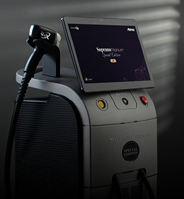
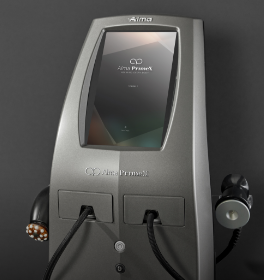
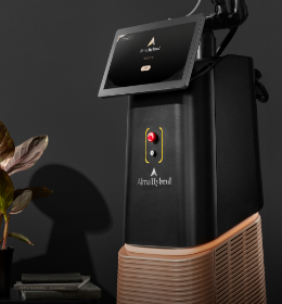
Designed for a wide range of ablative, non-ablative and thermal treatments, Alma HybridTM combines the power of three core energies, creating a uniquely synergistic effect.
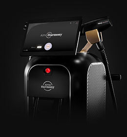
Safe, precise and versatile, HyGridTM gives you the benefit of both the CO2 and 1570nm lasers in one applicator, enabling you to custom-program the skin ablation-non ablation ratio in a matrix of the precise proportions required to meet the unique treatment needs of each and every patient.
The first and only device of its kind to bring together three powerful energies
Designed for a wide range of ablative, non-ablative and thermal treatments, Alma HybridTM combines the power of three core energies, creating a uniquely synergistic effect.

To maintain a visual connection to our sub-brands we use a triangular grid. While most Alma sub-brands use this grid to express their own visual identities, corporate uses only outlines.
The ratio between two lines will always remain 2:1.
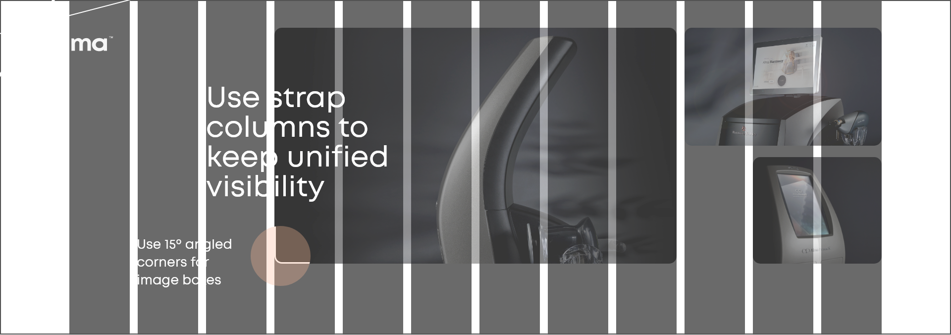
1920 px
12 columns
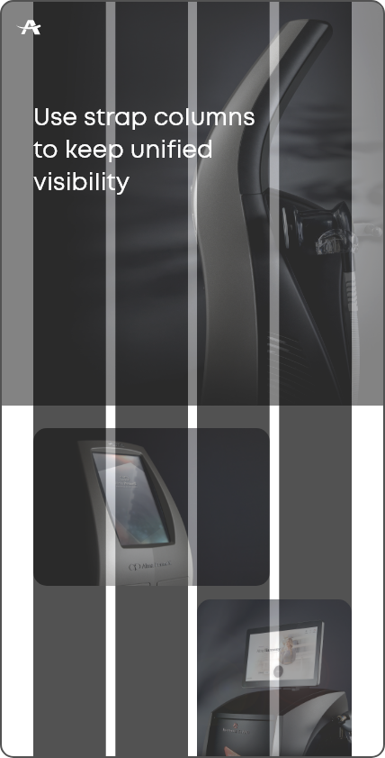
Mobile
4 columns
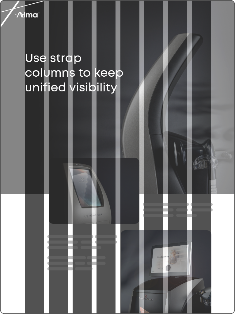
Tablet
8 columns
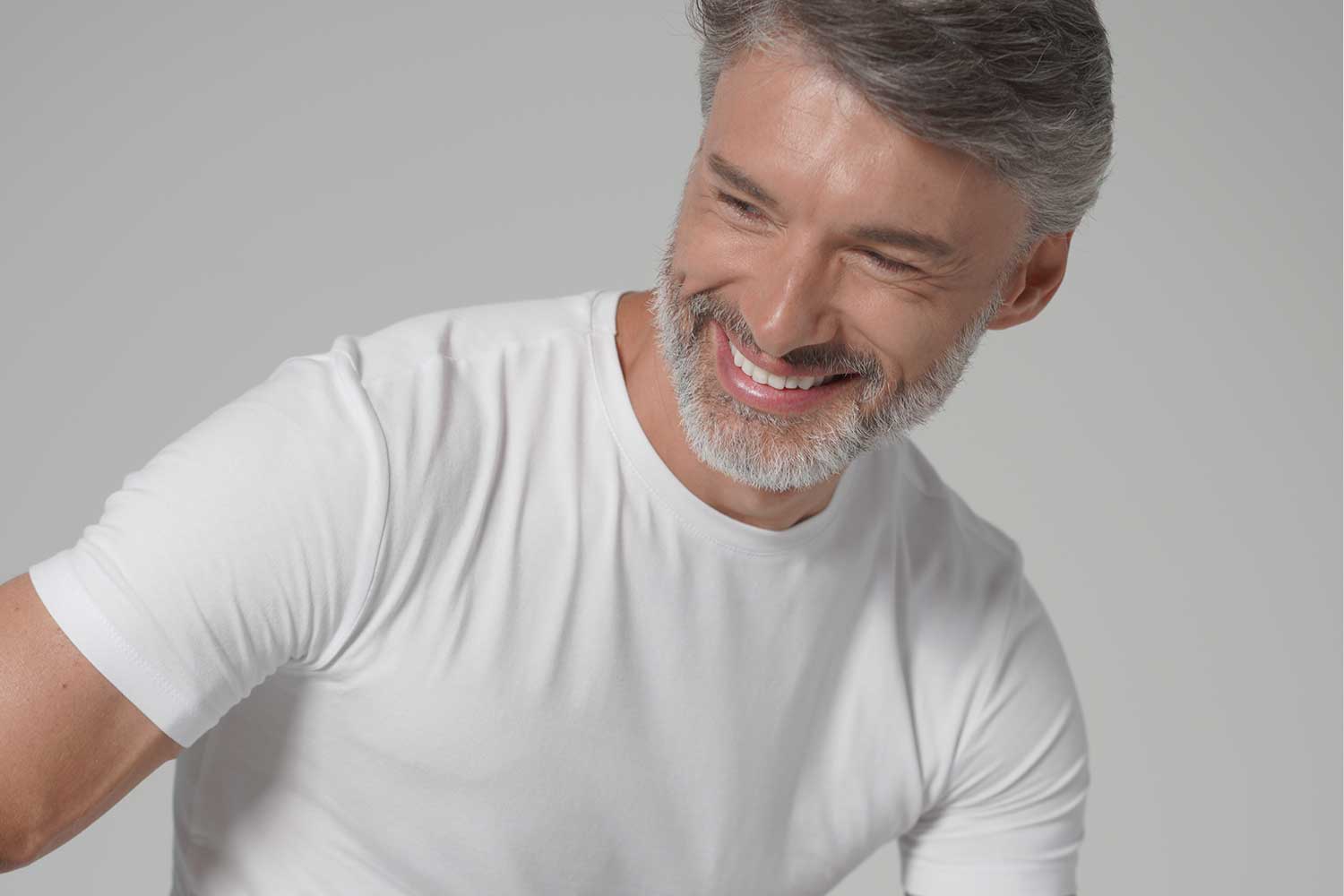
Our photographic style evolves with trends and innovations, but always aims to project aesthetics, wellbeing and positivity. We try to keep an honest real-life approach in our images.